Dropdown menus are a common feature in web design, allowing users to navigate various options in a hierarchical structure. While JavaScript is often used to create dynamic dropdown menus, it is also possible to create a simple dropdown menu without relying on JavaScript.
Dropdown Menu without JavaScript
Table of Contents
1. CSS Hover Dropdown Menu
i. Basic CSS Hover Dropdown Menu
One way to create a dropdown menu without JavaScript is by utilizing CSS hover effects. This method involves using the :hover pseudo-class to display the dropdown content when the user hovers over the menu item.
Here’s an example:
 <style>
    .dropdown:hover .dropdown-content {
      display: block;
    }
    .dropbtn{
      background-color: tomato;
      color: white;
      padding: 16px 20px;
      font-size: 16px;
      border: none;
      cursor: pointer;
      border-radius: 2px;
    }
    .dropdown-content {
      display: none;
    }
    .dropdown-content a {
      display: flex;
      justify-content: center;
      align-items: center;
      padding: 12px 16px;
      text-decoration: none;
      background-color: rgb(255, 197, 187);
      color: rgb(95, 15, 1);
    }
    .dropdown-content a:hover{
      background-color:tomato;
      color: #fff;
    }
    </style>

 <div class="dropdown">
      <button class="dropbtn">Dropdown</button>
      <div class="dropdown-content">
        <a href="#">Option 1</a>
        <a href="#">Option 2</a>
        <a href="#">Option 3</a>
      </div>
    </div>
Preview:
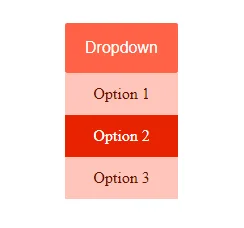
HTML code represents the structure of the dropdown menu. It consists of a button with the class dropbtn and a nested div with the class dropdown-content. The button serves as the trigger for the dropdown, and the div contains the actual dropdown items.
CSS rule specifies that when the .dropdown element is hovered, the style .dropdown-content should change. In this case, it sets the display property to, make the dropdown content visible. dropbtn block of styles sets the appearance of the dropdown button (dropbtn). It defines the background color, text color, padding, font size, and other visual properties. The button has a tomato background color with white text.
Initially, the dropdown content is hidden (display: none;). It will only be displayed when it .dropdown is hovered. Styles for the individual dropdown items (a) inside the .dropdown-content. They are displayed as flex containers with centred content. They have a background color of light peach (rgb(255, 197, 187)) and dark reddish-brown text (rgb(95, 15, 1)).
When a dropdown item has hovered, its background color changes to tomato, and the text color changes to white, providing visual feedback to the user. Overall, this code creates a simple and visually appealing hover dropdown menu with styled buttons and items.
ii. Mega Menu
  <style>
   .mega-menu {
  display: flex;
  background-color: #000000;
  color: #fff;
}

.menu-item {
  padding: 15px;
  cursor: pointer;
}

.menu-item a {
  text-decoration: none;
  color: #fff;
}

.mega-dropdown {
  position: relative;
}

.mega-content {
  display: none;
  position: absolute;
  top: 100%;
  left: 0;
  background-color: #555;
  min-width: 300px;
}

.column {
  float: left;
  width: 33.33%;
  padding: 10px;
  box-sizing: border-box;
}

.mega-dropdown:hover .mega-content {
  display: block;
}
    </style>

<div class="mega-menu">
    <div class="menu-item">
      <a href="#">Home</a>
    </div>
    <div class="menu-item mega-dropdown">
      <a href="#">Products</a>
      <div class="mega-content">
        <div class="column">
          <h4>Category 1</h4>
          <a href="#">Product 1</a>
          <a href="#">Product 2</a>
          <a href="#">Product 3</a>
        </div>
        <div class="column">
          <h4>Category 2</h4>
          <a href="#">Product 4</a>
          <a href="#">Product 5</a>
          <a href="#">Product 6</a>
        </div>
        <div class="column">
          <h4>Category 3</h4>
          <a href="#">Product 7</a>
          <a href="#">Product 8</a>
          <a href="#">Product 9</a>
        </div>
      </div>
    </div>
    <div class="menu-item">
      <a href="#">About Us</a>
    </div>
    <div class="menu-item">
      <a href="#">Contact</a>
    </div>
  </div>
Preview
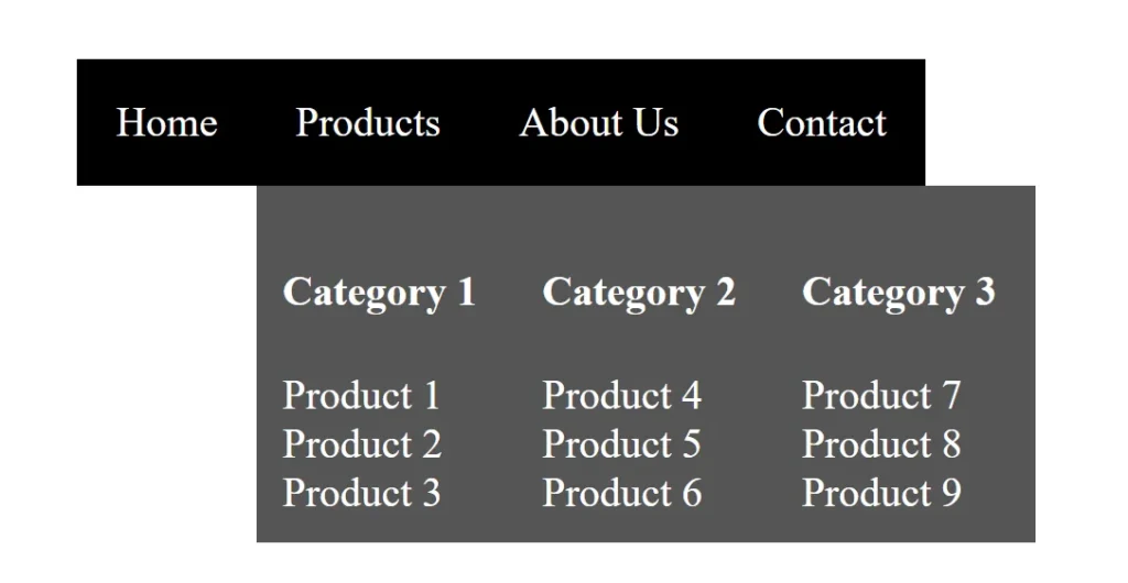
In this example, the Mega Menu has a “Products” menu item with multiple columns of content organized into categories. The sub-menu is hidden by default and is displayed when the user hovers over the “Products” menu item. Feel free to customize the content and styles based on your specific needs.
2. Using the Checkbox Dropdown Menu
Another method to create a dropdown menu without JavaScript is by utilizing the checkbox trick. This technique involves using a hidden checkbox input and the adjacent sibling selector to toggle the visibility of the dropdown content.
Here’s an example:
<style>
.dropdown-container {
      display: inline-block;
      position: relative;
    }

    .dropdown-content {
      display: none;
      position: absolute;
      top: 100%;
      left: 0;
      background-color: #fff;
      box-shadow: 0 4px 8px rgba(0, 0, 0, 0.1);
      border: 1px solid #ddd;
      border-radius: 4px;
      min-width: 160px;
      z-index: 1;
    }

    #dropdown-toggle:checked + .dropdown-container .dropdown-content {
      display: block;
    }

    .dropbtn {
      background-color: rgb(49, 0, 128);
      color: white;
      padding: 10px;
      font-size: 16px;
      border: none;
      cursor: pointer;
      border-radius: 4px;
    }

    .dropdown-content a {
      display: block;
      padding: 12px 16px;
      text-decoration: none;
      color: #333;
      transition: background-color 0.3s;
    }

    .dropdown-content a:hover {
      background-color: #f0f0f0;
    }
</style>
<body>
  <input type="checkbox" id="dropdown-toggle" class="dropdown">
  <div class="dropdown-container" id="dropdown-target">
    <label for="dropdown-toggle" class="dropbtn">Dropdown</label>
    <div class="dropdown-content">
      <a href="#">Option 1</a>
      <a href="#">Option 2</a>
      <a href="#">Option 3</a>
    </div>
  </div>
</body>
Preview
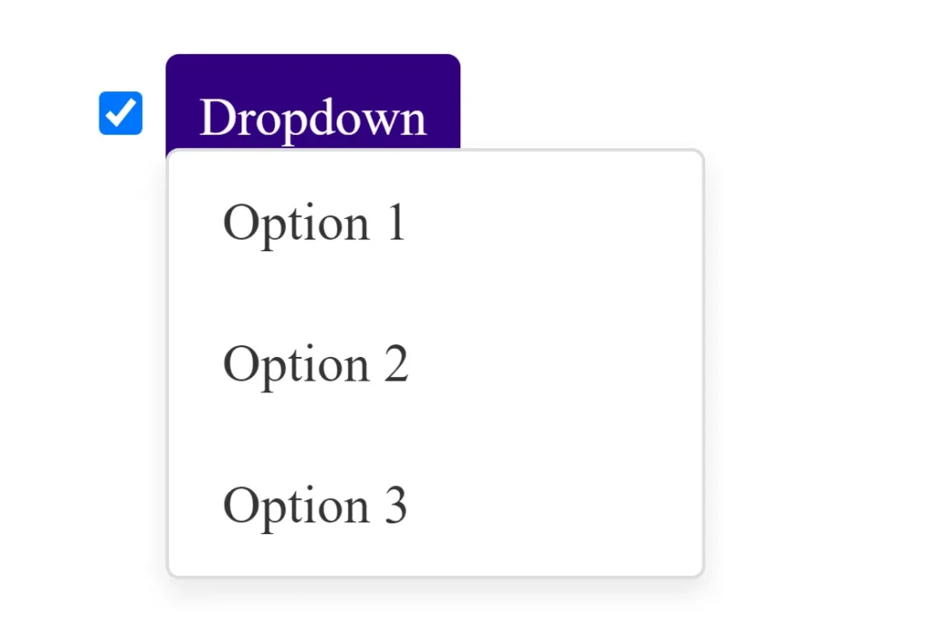
- HTML Structure:
- The dropdown menu consists of a checkbox (
#dropdown-toggle) and a label (dropbtn) that acts as the clickable button. - The dropdown content is contained within a
divwith the classdropdown-content.
- The dropdown menu consists of a checkbox (
- CSS Styling:
- Initially, the dropdown content is hidden (
display: none;). - The
:checkedpseudo-class is used to style the dropdown content when the checkbox is checked. - When the checkbox is checked, the adjacent sibling selector (
+) is used to select the.dropdown-containerand its child.dropdown-contentfor display.
- Initially, the dropdown content is hidden (
- Dropdown Interaction:
- Clicking on the label (
dropbtn) triggers the checkbox to be checked or unchecked. - The
:checkedpseudo-class applies styles to the dropdown content, making it visible when the checkbox is checked.
- Clicking on the label (
This example demonstrates how to create a simple dropdown menu using only HTML and CSS, without the need for JavaScript. The dropdown content is controlled by the state of the checkbox and the :checked pseudo-class is crucial for achieving this interaction.
3. Using the :target Selector
The :target selector can also be used to create a dropdown menu without JavaScript. This method involves using anchor links with unique IDs and the :target pseudo-class to toggle the visibility of the dropdown content.
Here’s an example:
<style>
.dropdown-container {
      display: inline-block;
      position: relative;
    }

    .dropdown-content {
      display: none;
      position: absolute;
      top: 100%;
      left: 0;
      background-color: #fff;
      box-shadow: 0 4px 8px rgba(0, 0, 0, 0.1);
      border: 1px solid #ddd;
      border-radius: 4px;
      min-width: 160px;
      z-index: 1;
    }

    .dropdown-container:target .dropdown-content {
      display: block;
    }

    .dropbtn {
      background-color: tomato;
      color: white;
      padding: 10px;
      font-size: 16px;
      border: none;
      cursor: pointer;
      border-radius: 4px;
      text-decoration: none;
    }

    .dropdown-content a {
      display: block;
      padding: 12px 16px;
      text-decoration: none;
      color: #333;
      transition: background-color 0.3s;
    }

    .dropdown-content a:hover {
      background-color: #f0f0f0;
    }
</style>
<body>
  <div class="dropdown-container" id="dropdown-target">
    <a href="#dropdown-target" class="dropbtn">Dropdown</a>
    <div class="dropdown-content">
      <a href="#">Option 1</a>
      <a href="#">Option 2</a>
      <a href="#">Option 3</a>
    </div>
  </div>
</body>
Preview
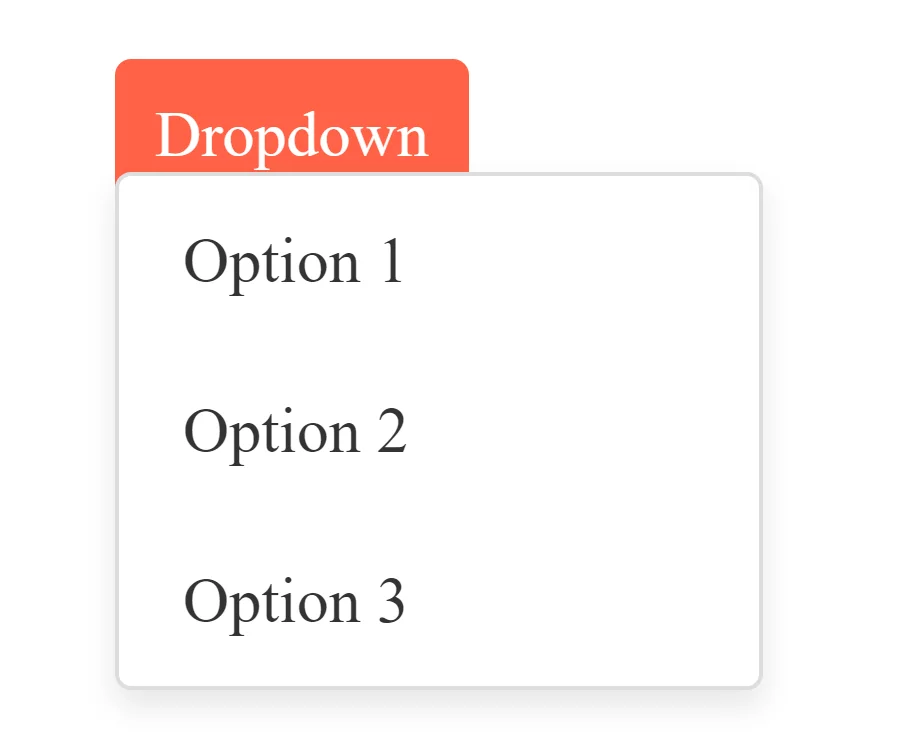
- HTML Structure:
- The dropdown menu consists of a container (
dropdown-container) with a clickable link (dropbtn) and a hidden dropdown content (dropdown-content). - The link has an
hrefattribute pointing to the ID of the container (#dropdown-target).
- The dropdown menu consists of a container (
- CSS Styling:
- Initially, the dropdown content is hidden (
display: none;). - The dropdown content becomes visible when the link with
href="#dropdown-target"is clicked, thanks to the:targetpseudo-class. - Styles for the link, dropdown container, and dropdown content are similar to previous examples, providing a clean and simple design.
- Initially, the dropdown content is hidden (
- Usage of
:targetPseudo-class:- The
:targetpseudo-class matches an element with an ID that matches the fragment identifier in the URL (the part after the#). - In this case, when the link is clicked, it triggers the
:targetstyles and displays the dropdown content.
- The

This method uses the power of the :target pseudo-class to create a dropdown without JavaScript, making it a lightweight solution.
Conclusion
These are just a few examples of creating a dropdown menu without JavaScript. By utilizing CSS hover effects, the checkbox hack, or the :target selector, you can add dropdown functionality to your website while keeping it lightweight and accessible. If you don’t know JS you can read Learn JS In 30 Days this post.

CTO at Humayra Group, leads a talented team in crafting innovative systems. A PHP and Laravel expert, he also excels in WordPress and front-end tech. As Co-founder of Base Software Ltd. and Founder of Priyo Career, he blends entrepreneurship with career guidance. Projuktibidda showcases his tech blog, while HikingVista reflects his passion for global travel and hiking. Omar, a trailblazer in both tech and exploration.

